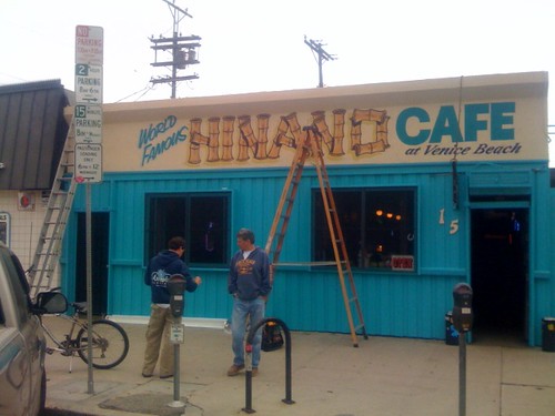
YoVenice reader Dee Ann sent in a picture titled “Hinano’s awesome new signage” this morning. Hinano understands the zen that every sign needs four distinct fonts on it to effectively sling brew and burgers, and we love them for it. Thanks for the picture Dee Ann! More breaking news to follow if they get around to cleaning the screens! (I’m headed there for lunch!)


4 responses so far ↓
1 D.SIL3000 // May 6, 2008 at 11:35 am
The old sign was sooooo much better. It had character and life. This looks like a cheesy mid ’90s attempt at “coastal” advertising. So generic!
2 josh s. // May 7, 2008 at 6:54 am
i love Hinano but am skeptical of anything that advertises itself as “world famous.” why do good things have to change?
3 deeann // May 7, 2008 at 9:34 pm
Like Sleeze said to me when I read him the responses: “I Did The Work. Bite Me.”
4 Steve // May 8, 2008 at 9:03 am
Who cares about the sign? It’s the burgers, sawdust, and beer inside that count.
Join The Discussion
You must log in to post a comment. If you do not have an account, you can register and get one.
It's free.
If you're having difficulty registering, please let us know.